What is a Wireframe in UX/UI Design?

A wireframe is a visual scheme that represents the structure of a website or mobile application.
Its purpose is to define the content and position of different elements within a digital application. This includes navbar, header, buttons, images, videos, texts, footer, or blocks.
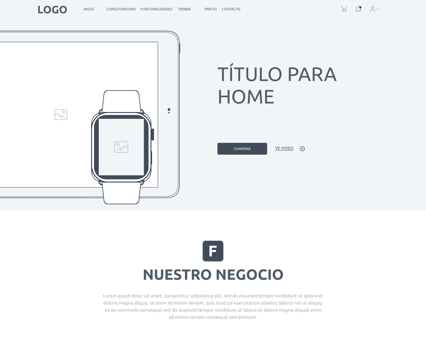
Wireframes are just sketches. They do not consider colors, typography, or final photos. The important thing is to create a structure that allows users to navigate a site in a fluid, simple, and intuitive way.
Wireframes in UX/UI Design
UX/UI design is a discipline that seeks to create simple, unique, intuitive, aesthetic, and pleasant digital experiences for users. To achieve this, multiple design tools are used, one of which is wireframing.
Wireframes are one of the first phases in designing a digital experience. They are the step before creating a final visual design.
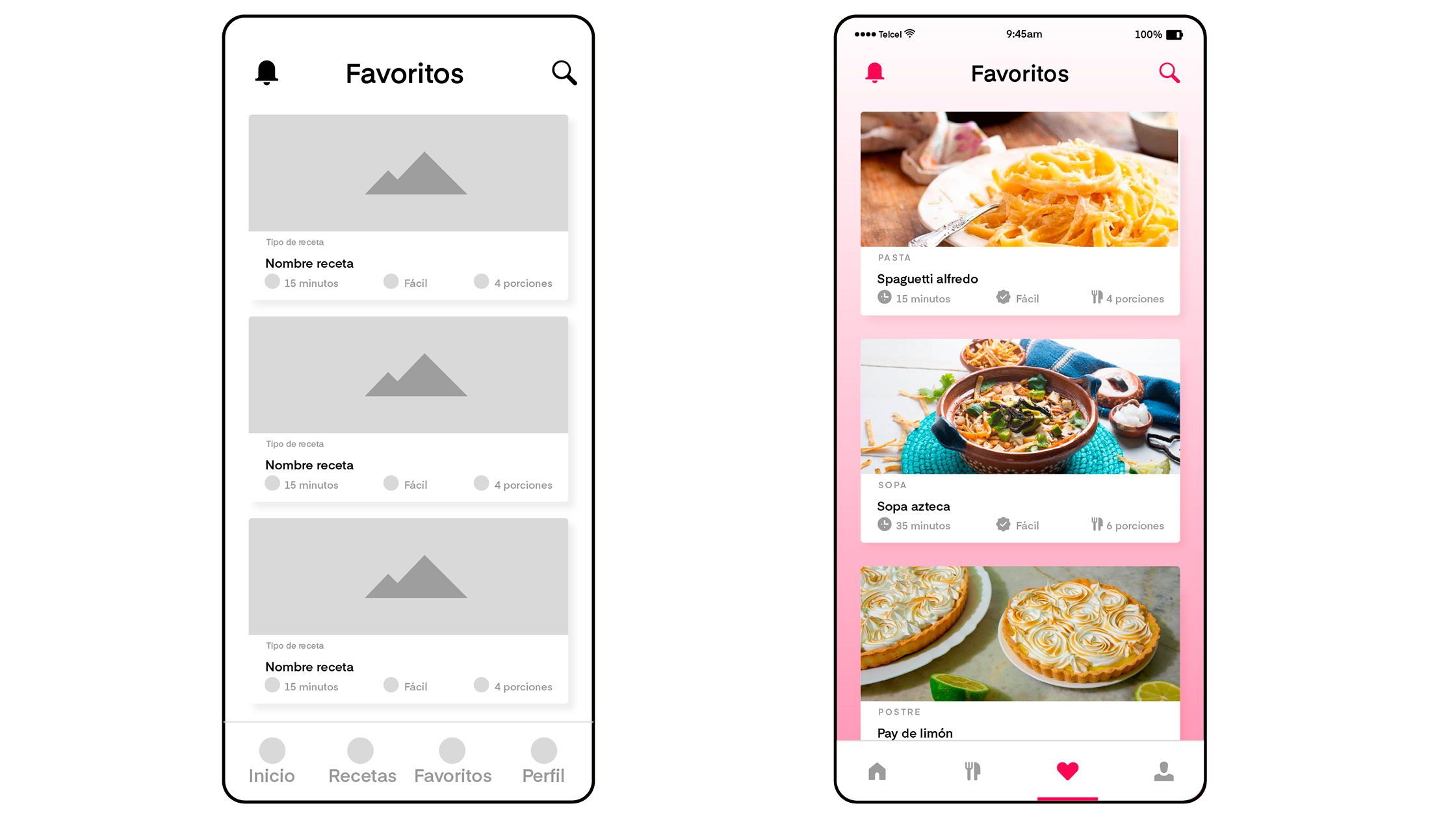
Wireframes are just sketches. They do not consider final colors, typography or photos. The important thing is to create a structure that allows users to navigate a site in a fluid, simple and intuitive way.
Wireframes in UX/UI Design
UX/UI design is a discipline that seeks to create simple, unique, intuitive, aesthetic, and enjoyable digital experiences for users. To achieve this, designers use multiple design tools, including wireframing.
Wireframes are one of the first phases in the design of a digital experience. They are the step before creating a final visual design.
Designers use them primarily to structure the composition of a page. When they have fully built the composition of the application, they can more easily move on to defining typography, colors, photographs, and images.
Advantages of designing Wireframes
Free and quick to create
A wireframe can be drawn by hand with a pencil. Additionally, there are multiple low-cost software tools that can help you design one.
Because it is not a final version that defines all the elements, colors, spacing, typography, and other design elements, it can be designed in a matter of hours.
Improve the usability of the application
The main reason for creating wireframes is to build a user-friendly experience.
In a wireframe, you can visualize the entire experience a user should have to effectively use your platform. If you feel that something is not working, you can go back and make corrections to the experience.
Detect errors before moving on to design and development
Designing a site that is not user-friendly from the beginning involves many costs in terms of time, resources, and lost sales in the long run.
All those parts that simply do not work for your user will have to be redesigned from scratch. This not only represents a cost in designers, but also in programmers who will have to redevelop the HTML and CSS of the site.
Not to mention the potential customers and sales that you will have lost because they did not understand how to use your application.
As you can see, a bad design can cost you time and money.
Better visualization of the application
Through a wireframe, the design and development team can visualize how the application should look.
Designers know which elements they need to design and style, and developers know which functionalities to program.
In addition, the entire team can provide feedback on the initial proposed wireframe to improve the design of the application.
This allows the team to work better together to bring the platform to life.
Elements of a wireframe
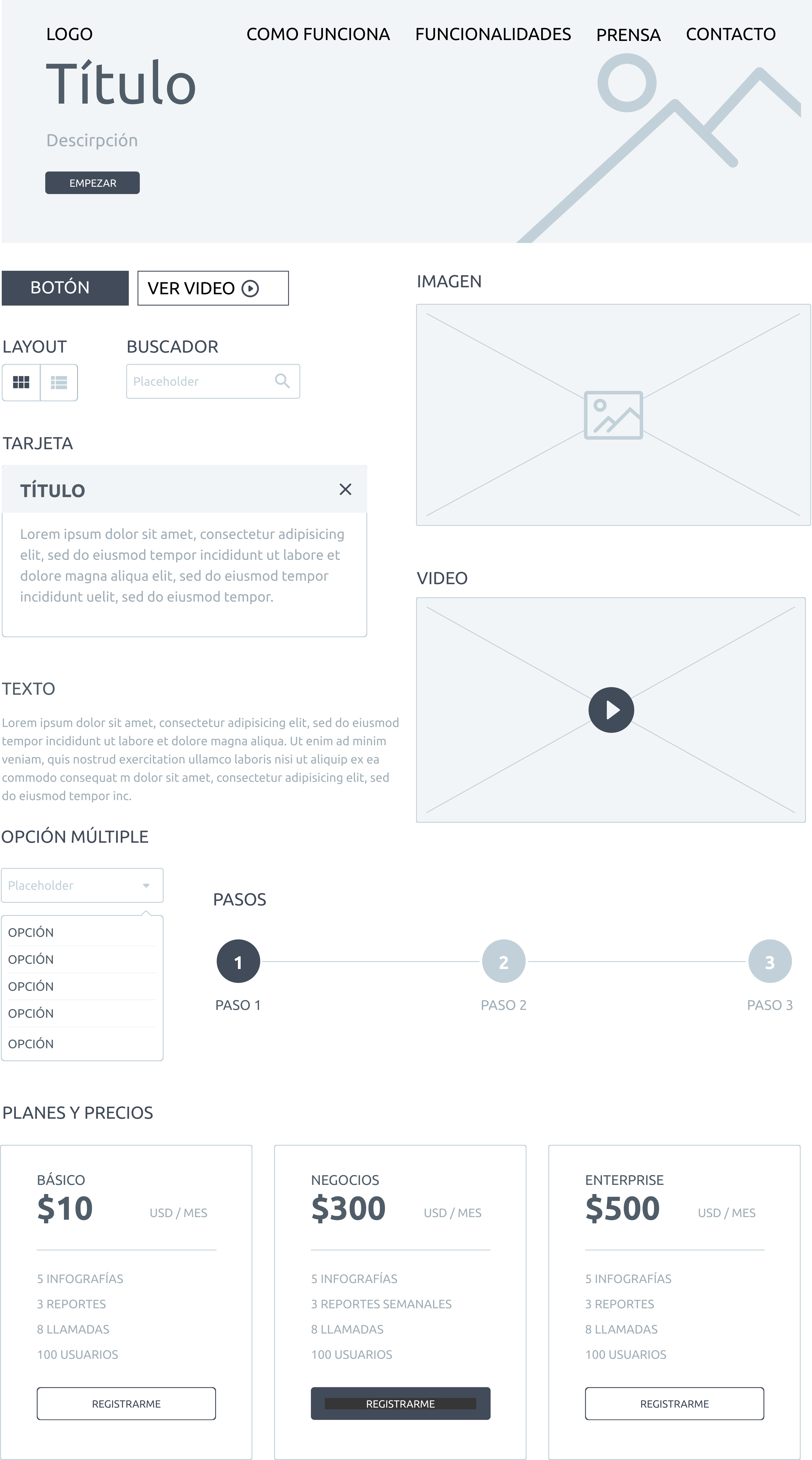
A wireframe can have multiple elements such as:
Logo
Link
Header
Icons
Images
Videos
Buttons
Search box
List
Navigation
Text field
Form
Map
All of these elements help structure your digital application.
There is no standard for which elements can be included in a wireframe or how they should look. The appearance of these elements depends on the designer and the tool they are using.
Just remember that when your wireframe is seen by other team members, they should be able to easily understand it.
How to design a Wireframe?
1. Research
You must know what product you are going to design, what problem it seeks to solve, and what the user's needs are. In this step, ideally, UX research should be carried out to understand the characteristics that the final product must have.
This step is probably the most important. To design great digital experiences, you must know your user. Otherwise, you will have designed a frustrating experience for your client, which will force you to redesign everything from scratch. This means design and development costs, as well as wasted time.
2. Choose your wireframing tool
You must choose the tool that best suits you to design wireframes. There are multiple tools for designing wireframes. We will see different options below.
3. Start with a simple version of your wireframe
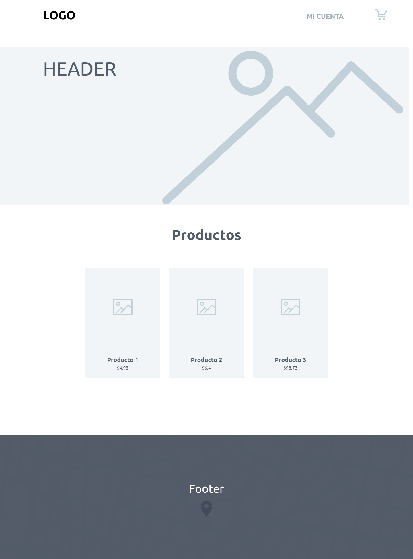
Design a simple sketch that helps you give structure to the main elements of your site. In this part, only put the most basic of your application: the navbar, logo, menu, header, and footer.
4. Design the elements that give logic to the experience
Add the content, text, images, and elements that build the complete user experience.
For example, if you're building an online store, define how the product pages will be structured, where the photo will go, the name of the item, the features, and the add-to-cart button.
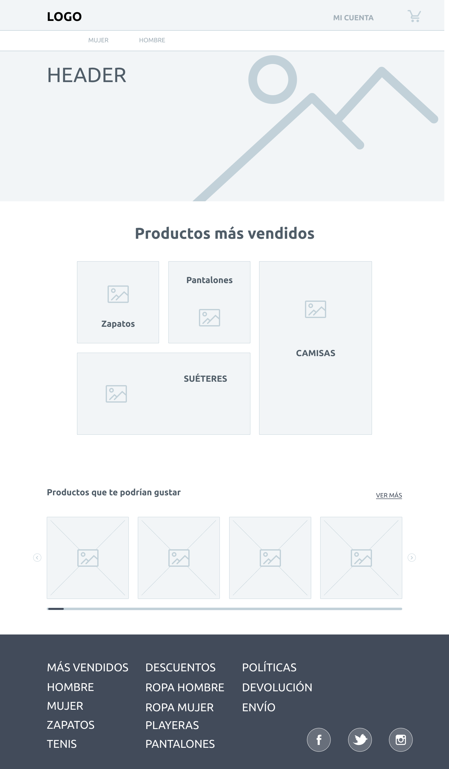
Add notes to your wireframe about: What each element is What its functionality is Links that lead to other pages Instructions on what should be shown in an image or video.
5. Realiza anotaciones en tu wireframe
Add notes to your wireframe about:
What each element is
What its functionality is
Links that lead to other pages
Instructions on what should be shown in an image or video
When you have finished your wireframe, it is time to share it with your design and development colleagues. This will help other designers understand how the site should be composed and which elements should be styled. And it will help programmers understand which functionalities they should develop for the site. Sharing the wireframe with the rest of the team also serves to receive feedback from more people, and to detect early on if something doesn't make sense or isn't working.
6. Share the wireframe with your team
When you have finished your wireframe, it is time to share it with your design and development colleagues.
This will help other designers understand how the site should be composed and which elements should be styled. And it will help programmers understand which functionalities they should develop for the site.
Sharing the wireframe with the rest of the team also serves to receive feedback from more people, and to detect early on if something doesn't make sense or isn't working.
Tools for designing a wireframe
Adobe XD
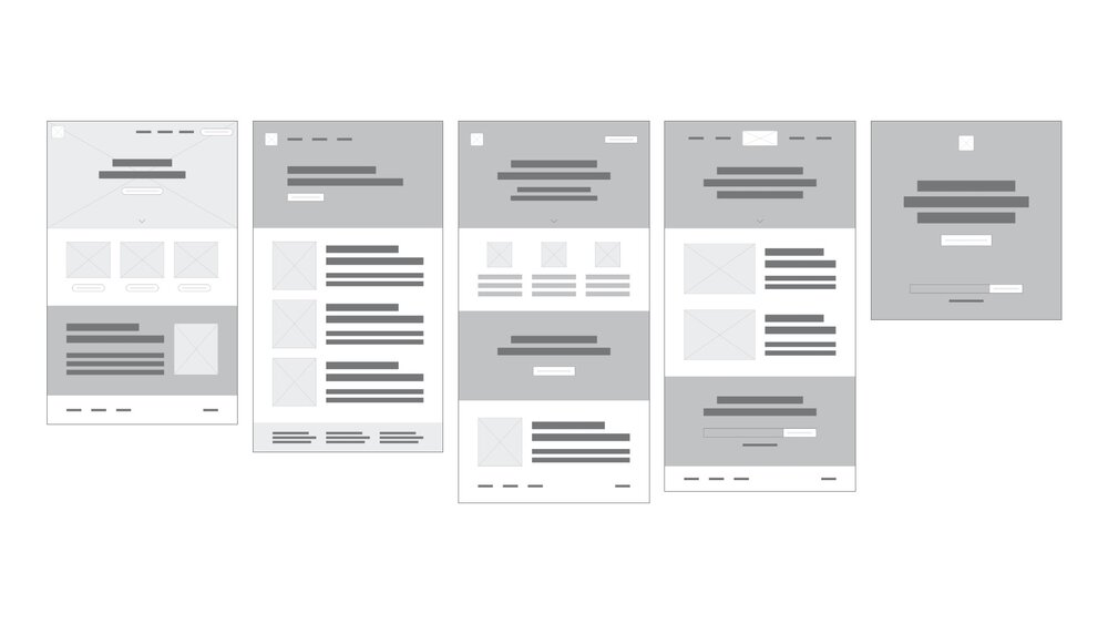
It is a vector-based web design tool for anyone who wants to create intuitive user interfaces and interactive layouts. It is packed with various built-in UI components that help designers create wireframes or mockups and then test them on various devices.
Figma
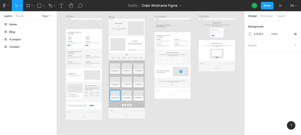
Figma is a powerful cloud-based design tool with a drag-and-drop interface for quickly designing and prototyping applications. It has an intuitive and expansive design that helps create multiple designs within a single project, making it ideal for teamwork.
Wireframe CC
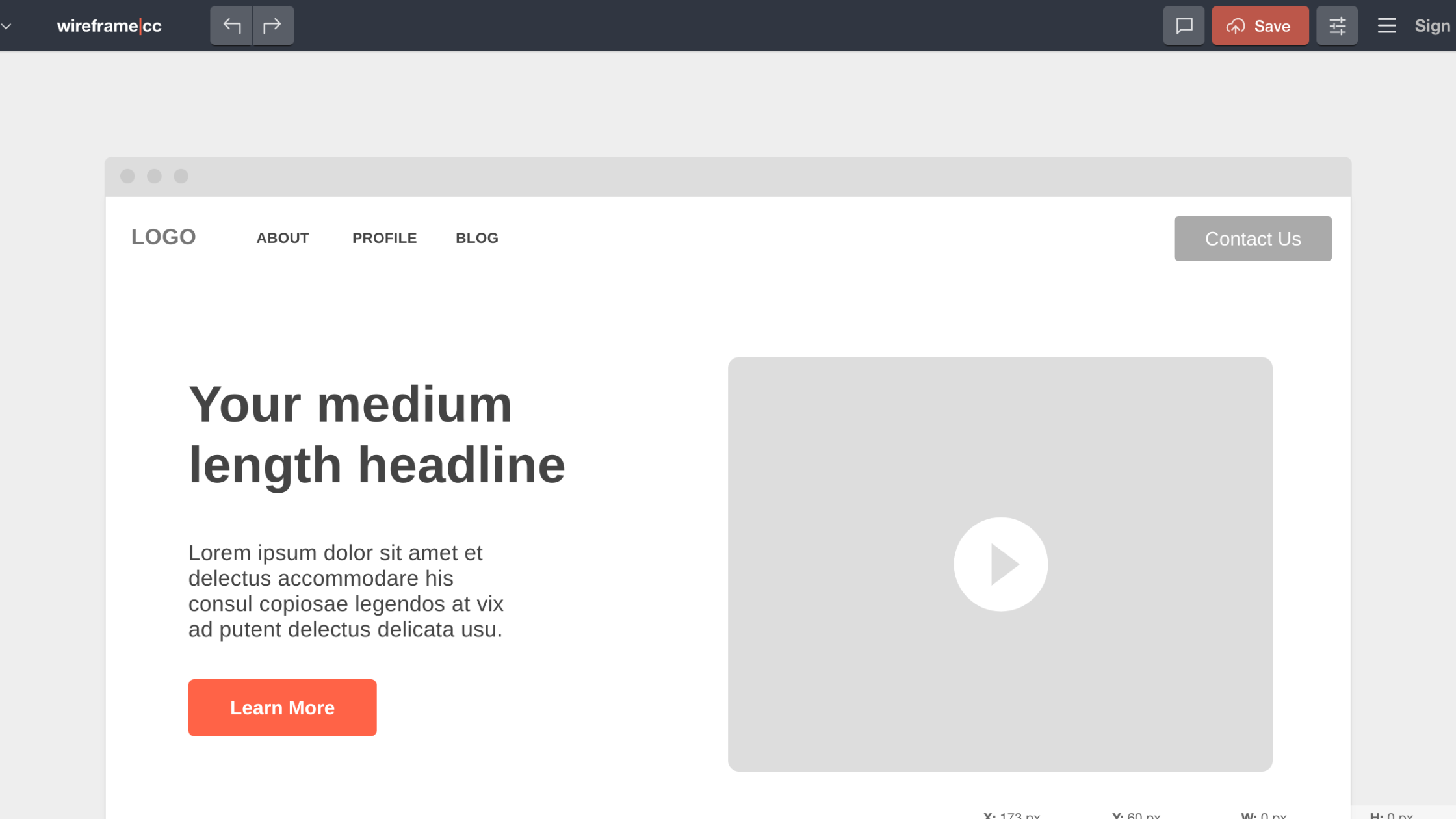
It is one of the best options if you need a simple and efficient tool for creating wireframes for websites or mobile applications. This web-based wireframing tool has a user-friendly and organized interface.
Cacoo
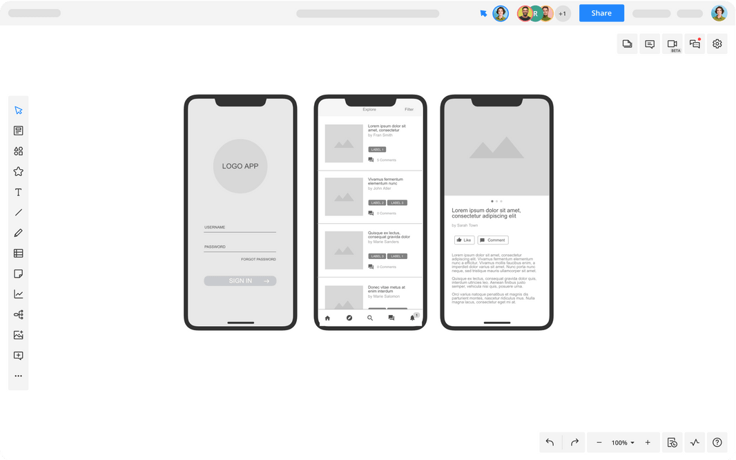
The tool you are referring to is Lucidchart, which is a diagramming tool that supports multiple collaborative projects. While it wasn't originally created as a UX design tool, it does offer a wide gallery of templates and integrations to build wireframes.
Lucidchart
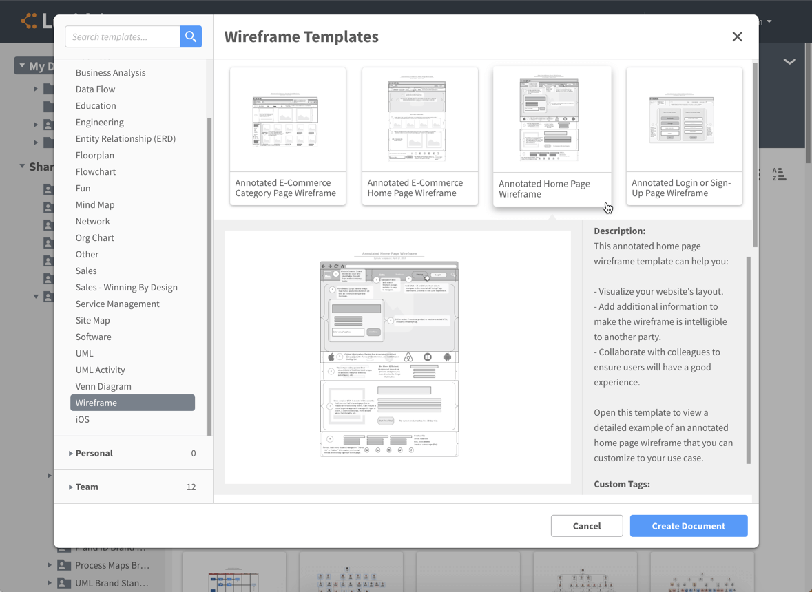
Tool for diagramming that allows real-time collaboration with other team members. It primarily functions as a tool for diagramming processes and systems. However, it has been found to be an excellent option for designing wireframes.


